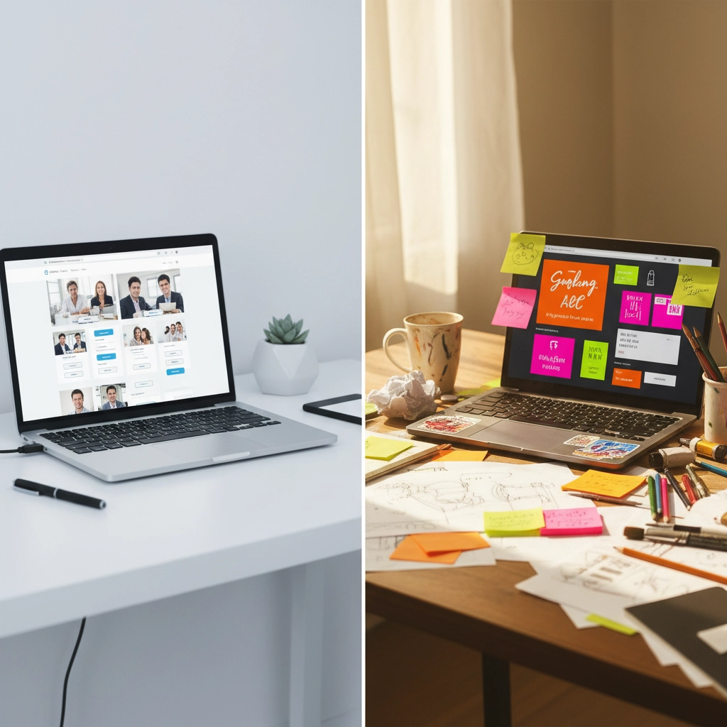
Remember when every website looked like it came off an assembly line? Perfect grids, pristine white space, and that same old “clean and professional” vibe that made every brand feel like a carbon copy of the last one you visited. Well, those days are officially over.
The web design world is having a rebellion, and it’s called anti-design. This isn’t just another trend that’ll disappear by next quarter – it’s a complete shift in how brands connect with their audiences online. And here’s the kicker: these “imperfect” websites are converting better than their polished counterparts.
The Death of Cookie-Cutter Perfection
Let’s be honest – we’ve all been there. You land on a website, and within seconds, you feel like you’ve seen it a hundred times before. The same stock photos, the same predictable layout, the same soul-crushing sameness that makes you question if there’s any real personality behind the brand.
That’s exactly what anti-design is rebelling against. This movement is deliberately breaking the rules that designers have followed religiously for years. Instead of playing it safe with symmetrical layouts and harmonious color schemes, brands are embracing chaos – and it’s working.
The shift represents something deeper than just aesthetics. It’s about authenticity in a world where everything feels manufactured. When every website looks like it was designed by the same algorithm, standing out means being willing to be messy, imperfect, and undeniably human.
What Exactly Is Anti-Design?
Anti-design isn’t just throwing design principles out the window and hoping for the best. It’s a strategic rebellion that breaks conventional rules while still serving its purpose. Think of it as controlled chaos with a clear mission.
The key elements that define this movement include:
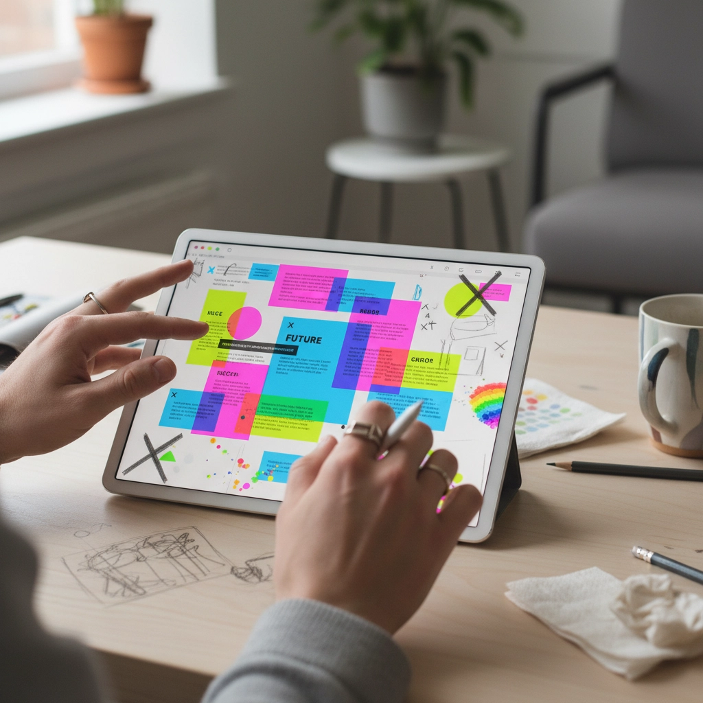
Asymmetrical layouts that make you look twice – Forget perfectly balanced grids. Anti-design websites deliberately create visual tension that keeps visitors engaged and slightly off-balance.
Clashing colors that shouldn’t work but do – We’re talking about color combinations that would make traditional designers cringe, but somehow create memorable experiences that stick with users long after they’ve left the site.
Typography that breaks all the rules – Overlapping text, extreme size variations, and experimental fonts that prioritize personality over perfect readability.
Intentionally rough edges – Raw, unpolished elements that feel hand-crafted rather than computer-generated. Think sketchy illustrations, imperfect photographs, and deliberately amateur-looking graphics.
Deliberate disruption – Every element is designed to create a slight sense of unease or surprise, making the user experience more memorable and engaging.
The key distinction here is that anti-design creates disruption without confusion. The navigation still needs to work, the message still needs to be clear, and users still need to accomplish their goals – but the journey feels completely different.
Why Anti-Design Actually Converts Better
Here’s where things get interesting. While traditional wisdom says that clean, professional designs build trust and drive conversions, the data is telling a different story. Anti-design websites are seeing higher engagement rates, longer session durations, and better conversion metrics. But why?
Authenticity builds genuine connections. When a website feels perfectly polished, it can create psychological distance between the brand and the user. People connect with other people, not with corporate perfection. Anti-design signals that there’s a real human behind the brand – someone who’s willing to take risks and show personality.
Memorable experiences drive action. In a world where users visit dozens of websites daily, being forgettable is the kiss of death. Anti-design websites stick in people’s minds because they break expectations. That memorable quality translates directly into higher recall and return visits.
Creative freedom attracts creative people. Particularly for agencies, startups, and creative businesses, anti-design demonstrates innovative thinking and willingness to push boundaries. Potential clients see the website as proof that the company isn’t afraid to challenge conventional wisdom.
Emotional engagement trumps aesthetic perfection. Anti-design websites evoke emotional responses – sometimes surprise, sometimes delight, sometimes mild discomfort – but never indifference. Emotional engagement is a powerful driver of conversion behavior.
The Psychology Behind the Trend
There’s actual psychology at work here. After years of being bombarded with perfectly polished digital experiences, users are experiencing what researchers call “aesthetic fatigue.” The human brain craves novelty and surprise, and anti-design provides exactly that.
Younger audiences, in particular, are drawn to brands that feel authentic and unfiltered. Growing up with social media, they’ve developed a keen ability to spot inauthentic, over-produced content from a mile away. Anti-design feels genuine in a way that traditional corporate websites simply don’t.
The trend also taps into our desire for human connection in an increasingly automated world. When everything from customer service to content creation is becoming AI-driven, deliberately imperfect design signals human involvement and creative decision-making.
Real-World Examples That Work
Some of the most successful anti-design implementations come from companies that have the confidence to completely abandon conventional wisdom. Take portfolio sites that use deliberately clashing color schemes, or e-commerce brands that embrace asymmetrical product layouts.
These sites grab attention immediately – not because they’re beautiful in a traditional sense, but because they’re bold and unapologetically different. They make users stop scrolling and actually engage with the content.
The key is that these websites still function flawlessly beneath their chaotic exterior. The navigation is intuitive, the checkout process is smooth, and the core user experience remains solid. The anti-design elements enhance rather than hinder the user journey.

How to Implement Anti-Design Without Going Too Far
Here’s the thing about anti-design: it’s easy to get wrong. The difference between effective anti-design and bad design is intention and strategy. Every “imperfect” element needs to serve a purpose.
Start by identifying which design rules you want to break and why. Maybe you want to create visual tension with asymmetrical layouts to keep users engaged longer. Or perhaps you want to use unexpected color combinations to make your brand more memorable.
Test everything ruthlessly. Anti-design might convert better overall, but that doesn’t mean every anti-design choice will work for every audience. Run A/B tests on different elements and measure actual user behavior, not just aesthetic preferences.
Maintain functionality at all costs. Your website can look chaotic and feel disruptive while still being incredibly easy to use. Never sacrifice usability for the sake of being different.
Consider your audience carefully. Anti-design works particularly well for creative industries, tech startups, and brands targeting younger demographics. It might not be the right choice for traditional industries where trust and stability are paramount.
The Future of Web Design
Anti-design represents more than just a trend – it’s a fundamental shift toward more human-centered digital experiences. As artificial intelligence makes it easier than ever to create “perfect” designs, the value of imperfection increases dramatically.
We’re moving toward a future where the most successful websites will be those that feel genuinely human rather than algorithmically optimized. This doesn’t mean abandoning good design principles entirely, but rather using them more selectively and intentionally.
The brands that embrace this shift early will have a significant advantage. They’ll build stronger emotional connections with their audiences, create more memorable experiences, and ultimately drive better business results.
Anti-design isn’t about being difficult or aggressive – it’s about being authentic and direct in your communication. In 2025, that authenticity is becoming the most valuable currency in web design. The question isn’t whether polished websites are dead, but whether your brand is brave enough to show its human side.